• Bhangra discussion is still going strong. Join us in our Facebook group!

    New user registration has been closed (as it was entirely spam). We encourage you to post in our Facebook group, even if it's a followup to an existing thread. BTF will continue to be archived and hosted here - Saleem

KINGS Prod. Flyer Work - Please Critique!

kinnell

*Account Deactivated*
Messages
2,159
Hey Guys,

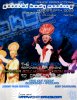
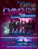
With Danny posting his work, I decided to post my flyers as well because I want to figure out what I can improve on. I would appreciate any critique and hope my fellow designers on BTF can help me out too (Swi, Danny, Armaan). As oppose to logos, these are flyers.

The first one is just for a general body meeting for an organization I am president of. Brownie points if you can guess which bhangra team was used to make that.

And the second one is for a competition that I'm hosting on campus that's open to Case dance teams.

Any critique is welcome! :)
K
 

Attachments

Waleed

New Member
Messages
729
kinnell said:
The first one is just for a general body meeting for an organization I am president of. Brownie points if you can guess which bhangra team was used to make that.
im gonna guess NJ
 

yraparla

SwizzeeMusic.com
Messages
2,072
definitely NJ!

also, not a fan of the blue splatter on font in the second one. I would prefer it clean so it's less distracting, but i could see how it'd be too similar to original


I'm off to class, i'll take a second look when i get there

edit:

Ok in the first one, it's really clean, but feels empty in the middle. You filtered the NJ image so it's not as distinct as you'd want the foremost image to be. The ekta is also blended and masked into bg so you're left with a top and bottom heavy flier, that draws you in to the middle...which has ranjit's head lol. I dunno what you'd do, maybe shift the dancers up or lower the top text or something. The background on both are really solid though. I noticed you slipped your favorite font into the second one :p
 

Danny

Member
Messages
698
sweet! id say theyre kinda harsh on the eyes at first. too many bright colors and techy fonts.......save all that business for the MAIN EVENT text and then go simpler with the details, location, time, etc of the event! and just to add on to that: make the MAIN EVENT text the MAIN part! eyes should hit that from a distance and one should not have to look twice my brother! and the 2nd one could use more contrast or have something abstract to get that attention (example: the red guy in the first one totally throws off the blue theme you got going which is good thing!) personally i think Less is ALWAYS MORE! =)

PS: ive noticed around my campus that events and party flyers are taking more of a typographic approach as opposed to when i first came to college a year ago every flyer had a pic of Kim K looking hot as hell (i guess that was the attention grabber) and then details very small under it

here's what i mean by the typography approach below:

http://fc03.deviantart.com/fs38/f/2008/326/a/b/Party_Flyer_by_r0man_de.jpg

http://th08.deviantart.net/fs24/300W/f/2007/322/6/5/Christmas_Party_flyer_by_Rev3ngeR.jpg
 

Danny

Member
Messages
698
stuff like that makes you actually wanna go and see what the fuss is about

heres another wallpaper i did before bruin along those lines too:
 

Attachments

kinnell

*Account Deactivated*
Messages
2,159
Swi said:
definitely NJ!

also, not a fan of the blue splatter on font in the second one. I would prefer it clean so it's less distracting, but i could see how it'd be too similar to original


I'm off to class, i'll take a second look when i get there

edit:

Ok in the first one, it's really clean, but feels empty in the middle. You filtered the NJ image so it's not as distinct as you'd want the foremost image to be. The ekta is also blended and masked into bg so you're left with a top and bottom heavy flier, that draws you in to the middle...which has ranjit's head lol. I dunno what you'd do, maybe shift the dancers up or lower the top text or something. The background on both are really solid though. I noticed you slipped your favorite font into the second one :p
Danny said:
sweet! id say theyre kinda harsh on the eyes at first. too many bright colors and techy fonts.......save all that business for the MAIN EVENT text and then go simpler with the details, location, time, etc of the event! and just to add on to that: make the MAIN EVENT text the MAIN part! eyes should hit that from a distance and one should not have to look twice my brother! and the 2nd one could use more contrast or have something abstract to get that attention (example: the red guy in the first one totally throws off the blue theme you got going which is good thing!) personally i think Less is ALWAYS MORE! =)

PS: ive noticed around my campus that events and party flyers are taking more of a typographic approach as opposed to when i first came to college a year ago every flyer had a pic of Kim K looking hot as hell (i guess that was the attention grabber) and then details very small under it

here's what i mean by the typography approach below:

http://fc03.deviantart.com/fs38/f/2008/326/a/b/Party_Flyer_by_r0man_de.jpg

http://th08.deviantart.net/fs24/300W/f/2007/322/6/5/Christmas_Party_flyer_by_Rev3ngeR.jpg
Thanks so much for this! Definitely helps a bit! And I've been trying my hand at typographical flyers, but no success yet. Hopefully I can get the hang of it since they have yet to hit Case campus and would be really effective.

I feel like making flyers is also knowing the scene you're trying to promote in. Since there are no typographical flyers here, they would really hit hard since it's something new.

Danny said:
stuff like that makes you actually wanna go and see what the fuss is about

heres another wallpaper i did before bruin along those lines too:
lol That's definitely my favorite APD work ever. I remember that I made made a graphic that spelled out TRUSKOOL FOLK with the names of everyone on the team. And then a week later, I saw your thing and while it's completely different, I was like DAMN now THAT's SEX ON PAPER.
 

mafzal

Judge / Dancer
Messages
2,098
kk i'm no expert but from general audience I don't like the 1st one something isn't right (text).
second one is dope I like it a lot
 
Top